AIK Nike home shirt launch uses historic 1891 artwork to mark 135th anniversary
AIK Took a Completely Different Route With Their New Nike Home Shirt — And Football Fans Are Loving It
Football kit launches have become strangely predictable lately.
A dramatic teaser video, Slow-motion tunnel shots, Players staring into the camera like they’re filming a luxury fragrance advert. Scroll for five seconds during pre-season and most shirt reveals start blending into one long algorithm-friendly blur.
That’s why AIK have managed to grab attention in a way very few clubs do anymore.
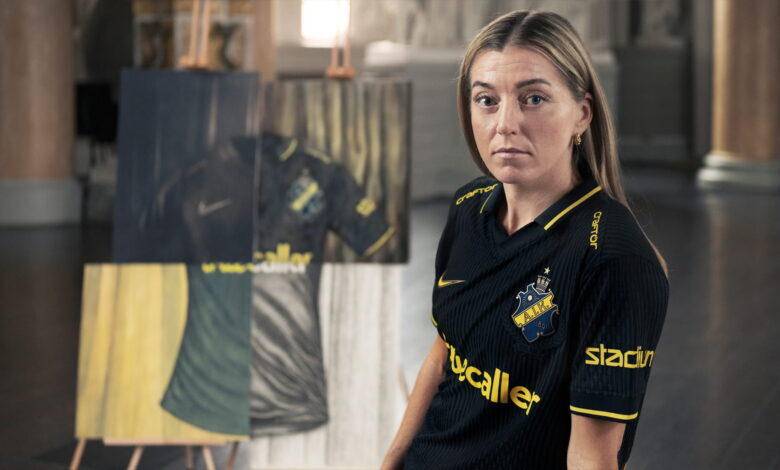
To celebrate the club’s 135th anniversary, AIK unveiled their new Nike home shirt using creative techniques that date back to 1891, the same year the club was founded. And instead of revealing the jersey immediately, they turned the entire launch into something closer to an art exhibition than a standard football campaign.
Honestly, it feels refreshing.
A football shirt reveal built around history, not hype
Most clubs talk about “honouring heritage” whenever a retro-inspired kit arrives. AIK actually committed to the idea properly.
Rather than posting polished digital renders or heavily edited promo content, the Swedish side invited four different artists to create separate interpretations of the new shirt using only artistic methods and materials authentic to the late 19th century.
Each artist was responsible for one section of the jersey reveal. Once combined, the four pieces formed the complete design of the 2026 home shirt.
It’s the kind of concept that could easily have felt gimmicky if handled badly. Instead, the whole thing comes across thoughtful and genuinely creative.
More importantly, it feels connected to the club itself rather than just being marketing for marketing’s sake.
Where football meets old-school craftsmanship
What makes the project stand out even more is the amount of detail behind it.
More than 200 hours of handcrafted work reportedly went into the campaign, with every artist sticking closely to techniques available during the 1890s. That meant no shortcuts, no modern digital fixes, and no quick AI-generated visuals pretending to look vintage.
And you can actually feel that difference in the final result.
Swedish artist Klara Zetterholm created an oil painting using historically accurate materials, including traditional paint mixtures and period-style canvas mounting.
Even the texture of the brushwork was designed to mirror artistic techniques from that era.
Another section came through the work of Hans Jonsson, who used wet plate collodion photography, one of the earliest photographic processes still associated with the 19th century. The method itself sounds exhausting by modern standards, involving glass plates, silver nitrate treatment, and immediate development inside a portable darkroom.
The final image gives the shirt an almost ghost-like appearance, somewhere between football culture and historical archive photography.
Then there’s Svalan Sörblom, whose Belle Époque-inspired poster adds a completely different energy to the project. Using gouache, pencil, and ink, the artwork channels the dramatic style of classic European cultural posters from the late 1800s.
And finally, Tessan Graf stripped things back through an incredibly detailed ink line drawing made up of thousands of individual strokes. Slow, meticulous work. The kind of process modern football content rarely has patience for anymore.
The bigger picture here
What AIK have done is bigger than simply releasing another football shirt.
This campaign taps into something clubs are increasingly trying to rediscover: identity.
Modern football culture moves incredibly fast now. New kits arrive every year, social media trends disappear overnight, and some launches feel designed more for engagement metrics than supporters themselves.
AIK went the opposite direction.
Instead of chasing futuristic visuals or overproduced hype videos, they looked backwards all the way to the club’s beginnings and built an entire release around craftsmanship and storytelling.
That’s probably why so many football fans outside Sweden have reacted positively to it too. Even if you don’t support AIK, you can appreciate when a club does something with actual thought behind it.
And in fairness, not every shirt launch needs fireworks or celebrity cameos. Sometimes originality lands harder when it’s quieter.
More clubs might start paying attention
Football and fashion have become deeply connected over the last decade, but football and art still feel slightly underexplored at club level. AIK may have stumbled into something important here.
The campaign proves that kit launches can still surprise people when clubs are willing to take creative risks that actually fit their identity.
Because at its best, football culture has never been only about the shirt itself. It’s about memory, community, symbolism, and the stories clubs choose to tell around those colours.
AIK understood that.